Furi Seeker SE Kiteboard
Product design and graphics for a wood core kiteboard targeting schools and beginner riders.
Client
Furi Kiteboarding
Services
Product Design, Graphic Design
Industries
Watersports, Kiteboarding
Date
2021
Challenge
Create a skin, layout and graphic for the wood core board as part of the Seeker Series for 2021.
The Seeker SE is one of three ranges targeting kiteboarding schools and beginner riders. Furi needed a board design that could encapsulate the brand while standing apart from what was already flooding the market. Most kiteboard graphics felt either too aggressive or too corporate. Furi wanted something that spoke to the lifestyle, the places you ride, the feeling of being on the water.
The design had to work within real manufacturing constraints. Print registration, material layup, edge detailing. A beautiful concept means nothing if it falls apart in production. The brief was clear: create something distinctive that could actually be built and shipped.


Solution
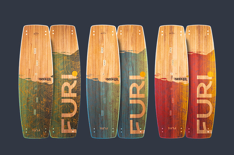
We went with nature-inspired artwork that felt organic against the bamboo wood core. Palm trees, mountain silhouettes, gradient skies. The kind of scenery you actually see from the beach when you're about to go ride. It captures that moment of anticipation before you hit the water.
The color palette was deliberate. Warm sunset tones, ocean blues, earthy greens. Each variant in the range has its own mood, but they all share the same visual language. The Furi wordmark sits bold and readable, angled to follow the board's shape rather than fighting it.
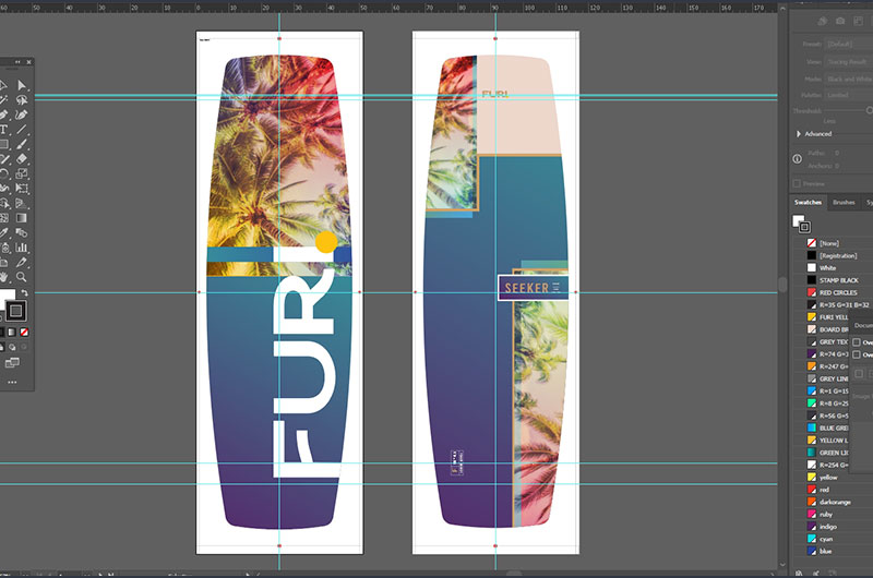
Every element was built in Illustrator with production in mind. Clean vectors, proper bleed areas, registration marks where the factory needed them. We worked through multiple rounds with the manufacturing team to make sure what we designed on screen would translate to the finished product.
The Seeker branding ties into the series name. Seekers chase conditions, explore new spots, look for the next session. The graphics reflect that spirit without being too literal about it.
Outcome
The Seeker SE went into full production and shipped to dealers in Germany and South Africa. Schools picked it up for their fleets, and beginner riders gravitated toward the approachable aesthetic. It didn't look like a pro board trying too hard. It looked like something you'd actually want to learn on.
The design held up through manufacturing without any major compromises. Colors printed true, registration stayed tight, the bamboo grain showed through the translucent areas exactly as planned. Furi used the visual language we developed across their marketing materials for the 2021 season.
This project was a reminder that product design for physical goods is a different beast. You're not just making something look good in a mockup. You're working with factories, materials, tolerances, and shipping realities. When the final boards arrived and matched what we'd envisioned, that was the real win.
 Let's talk about your project!