Furi Seeker LT Kiteboard
Product design and graphics for a wood core kiteboard targeting professionals and intermediate riders.
Client
Furi Kiteboarding
Services
Product Design, Graphic Design
Industries
Watersports, Kiteboarding
Date
2021
Challenge
Create a skin, layout and graphic for the wood core board as part of the Seeker Series for 2021, targeting professional and intermediate riders.
The Seeker LT sits in a different space than its SE sibling. This board is for riders who've moved past the learning phase and want something that performs. The graphics had to reflect that progression without losing the Furi identity we'd already established. More refined, more focused, but still unmistakably part of the same family.
The challenge was creating visual distinction within a unified product line. Both boards share the same wood core construction and brand DNA, but they speak to different riders at different stages. The LT needed to feel like an upgrade, not just a color swap.
Solution
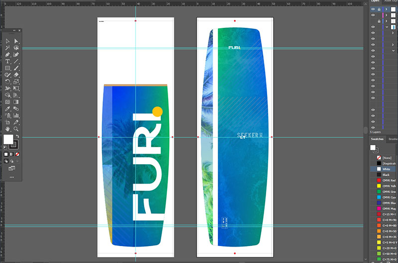
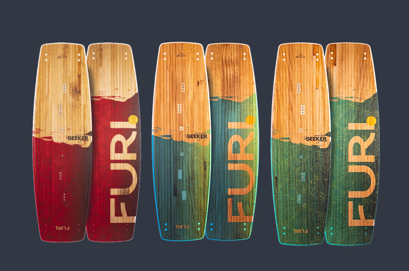
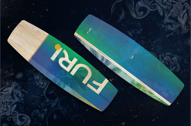
We shifted the palette toward cooler tones. Ocean blues, teals, deep greens. Where the SE felt warm and approachable, the LT feels calm and focused. The color story suggests depth, experience, and progression without being heavy-handed about it.
The same nature-inspired artwork carries through, but with a different mood. Subtler gradients, more sophisticated layering. The palm tree motifs are still there, but they feel more abstracted, more integrated into the overall design rather than sitting on top of it.
We kept the bold Furi wordmark central to the design. Consistency across the product line matters when you're building a brand. Riders should be able to spot a Furi board from across the beach, whether it's an SE or an LT. The typography and logo placement remain identical, anchoring the visual identity.
Production-wise, we faced the same constraints as the SE. Everything had to translate cleanly from Illustrator to the factory floor. We worked with the same manufacturing team, which meant we could build on what we'd already learned about print registration and material behavior.
Outcome
The Seeker LT went into production alongside the SE and shipped to the same markets in Germany and South Africa. Having both boards launch together meant dealers could offer a clear progression path. Start on the SE, graduate to the LT when you're ready.
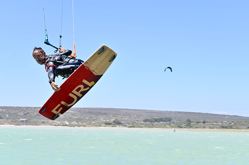
Intermediate and pro riders responded well to the more refined aesthetic. The boards showed up at spots in Langebaan and along the German coast, getting the kind of real-world testing that proves whether a design actually works. The graphics held up to salt, sun, and the abuse that comes with serious riding.
Working on both the SE and LT gave us a deeper understanding of product line design. It's not just about making two nice things. It's about creating a system where each product has its own identity while contributing to a larger brand story. The Seeker series proved that approach works.
 Let's talk about your project!