Everyone Can Build a Website Now. So Why Does Everything Look the Same?
In this article
- Everyone can build a website now
- From templates to prompts: how web design changed
- Why every AI-built website looks the same
- Why looking the same quietly costs you money
- Pretty is not the same as working
- Search has changed, so every visit counts more
- What bespoke web design actually means
- What that looks like in real projects
- Why the relationship matters more than the website
- How to make your website stand out in 2026
- Frequently asked questions
Open ten new startup websites in ten browser tabs and flick between them. You will see the same soft purple gradient behind the same bold headline, the same three rounded feature cards, the same indigo button that says Get Started. Change the logo and you could swap the homepages around without anyone noticing. Most of them were built in an afternoon, and it shows.
That is the strange place web design has arrived at in 2026. Building a website has never been easier, faster or cheaper. And standing out with one has never been harder. This article is about how we got here, why sameness quietly costs businesses money, and what it actually takes to build something your customers remember.
Everyone can build a website now
Five years ago, getting a custom website meant hiring a designer, a developer, or both. Today anyone with an idea and a browser can describe what they want and watch it appear. The numbers behind this shift are staggering. Lovable, one of the best known prompt-to-app tools, reported in August 2026 that it had passed $500 million in annualised revenue, with around 60 million projects built on the platform (TechCrunch). Wix bought the AI app builder Base44 in June 2025, just six months after it launched, and in January 2026 launched Wix Harmony, its own AI site builder, with a Super Bowl advert. Framer now ships AI agents that edit live production sites. Figma has Figma Make.
We think this is genuinely good news. Ideas that would never have been funded now get tested. A bakery owner can put a menu online over breakfast. A founder can show investors a working prototype instead of a slide. We use these tools ourselves, every week, and they make us faster.
But when everyone gets the same superpower at the same time, it stops being a superpower. It becomes the baseline. And a baseline, by definition, is what everyone else has too.
When everyone can build a website, having one stops being an advantage. Having one people remember becomes the whole game.
From templates to prompts: how web design changed
It helps to remember what traditional web design looked like. For most of the last twenty years, a business website followed a familiar path. You briefed an agency or a freelancer. They sketched a sitemap and wireframes, designed a few pages, and you went back and forth on revisions. A developer turned the approved designs into code, usually on WordPress. The whole thing took weeks or months and cost enough that most small businesses only did it once every few years.
That process was slow, and it was often frustrating. But it had one quiet strength. Somewhere along the way, a person had to sit with your business long enough to understand it. Even a mediocre designer asked who your customers were and what you wanted them to do. The friction forced the thinking.
Then came templates. Theme marketplaces made it possible to buy a polished design for the price of a lunch and pour your content into it. Page builders let anyone drag sections around without code. Websites got cheaper and faster, and for the first time they also started to look alike. The same premium theme would appear on a law firm, a yoga studio and a crypto startup in the same week.
AI is the next and far bigger step in that same direction. It removes almost all of the remaining friction. You no longer need to choose a template, because the model chooses for you. You no longer need to write the copy, because the model writes something plausible. What disappears with the friction is the part where anyone stops to think about your business. The result is not a bad website. It is an anonymous one.
Why every AI-built website looks the same
In August 2025, Adam Wathan, the creator of the Tailwind CSS framework, posted a half joking apology online. Years earlier, his team had made the default button colour in their Tailwind UI kit indigo. He apologised for that choice "leading to every AI generated UI on earth also being indigo" (Adam Wathan on X). It spread quickly because every designer and developer reading it knew exactly what he meant.
AI builders learn from the code that already exists on the internet. A huge share of modern web code uses the same handful of frameworks and component libraries, with the same defaults. So when you ask a model for a landing page, it gives you the average of everything it has seen. That average has a look: an Inter or Geist typeface, a violet gradient, glassy cards, generous rounded corners, a hero headline with one word highlighted, and a row of logos underneath.
None of those choices are bad on their own. The problem is that they are nobody's choices. They are defaults. The tool did not know that your brand is warm and a little irreverent, that your customers are retirees who need larger text, or that your competitor down the road already owns the colour purple in your market. It could not know, because nobody asked those questions.
Quick check
Which colour did the creator of Tailwind CSS jokingly apologise for making the default of AI-generated interfaces?
Designers have started pushing back. The trend reports for 2026 are full of reactions against the polished AI look: raw, brutalist layouts, deliberately imperfect hand-drawn marks, and oversized expressive typography that moves as you scroll. Some of it is fashion, and fashion passes. The instinct underneath it will not. People are tired of websites that feel like nobody made them.
Why looking the same quietly costs you money
It is tempting to treat all of this as a matter of taste. It is not. First impressions online happen faster than most people realise. In a well known 2006 study, researchers led by Gitte Lindgaard found that people formed a judgement about a web page's visual appeal in around 50 milliseconds, and that judgement stayed remarkably stable when they looked for longer (Behaviour & Information Technology). That is less time than it takes to blink.
Appeal feeds straight into trust. When Stanford's Persuasive Technology Lab asked more than 2,600 people how they decided whether a website was credible, the look of the site came up in 46% of their comments, more than any other factor (Stanford Web Credibility Research). People do judge a book by its cover. Then they decide whether to hand it their card details.
Test your instincts
Roughly how long did people in the Lindgaard study need to form a judgement about a web page's visual appeal?
Here is where sameness bites. If your site looks like a template, visitors quietly file you with every other template they have seen this week. You become interchangeable. And when you are interchangeable, the only thing left to compete on is price. A distinctive brand gives people a reason to choose you that has nothing to do with being the cheapest.
Speed matters just as much as looks. In Google and Deloitte's Milliseconds Make Millions study, which followed 30 million sessions across 37 brands, making a mobile site just a tenth of a second faster lifted retail conversions by 8.4% and travel conversions by 10.1% (web.dev). Many AI-generated sites are heavy, loading libraries and animations they do not need. Pretty and slow is still slow.
A website is not a poster. It is a salesperson who works every hour of every day. It should be judged on what it sells, not only on how it looks.
Pretty is not the same as working
The sameness problem sits on the surface. Underneath it there is a bigger one. A website or web app that looks finished can be anything but.
In 2025, a security researcher scanned 1,645 apps built with Lovable and found that 170 of them, about one in ten, were exposing user data because the database access rules had never been switched on (CVE-2025-48757). The same summer, Veracode tested code from more than 100 AI models and found that 45% of the samples introduced a well known class of security flaw (Veracode GenAI Code Security Report). And in one widely reported incident, an AI coding agent deleted a company's production database during a declared code freeze.
None of this means the tools are bad. It means they are tools. They build what you ask for, and most people do not know to ask about access rules, input validation or what happens when a thousand people sign up on the same morning. We wrote about this in more depth in Vibe Coding Won't Save You. The short version is that building something that runs is not the same as building something that lasts.
Quick check
Veracode tested code written by more than 100 AI models. Roughly what share of the samples introduced a known security vulnerability?
Search has changed, so every visit counts more
There is one more shift worth understanding. Google now answers many questions directly at the top of the results page with an AI Overview. Pew Research found that when one of those summaries appeared, people clicked through to a regular result 8% of the time, compared with 15% when there was no summary, and only around 1% clicked a link inside the summary itself (Pew Research Center).
Fewer clicks means each visitor who does arrive is worth more. You cannot afford to waste them on a page that looks like everyone else's, loads slowly on a phone, or hides the one thing they came to do. The job of a website in 2026 is not to exist. It is to convert the smaller number of people who make it through the door, and to give AI assistants something original and clearly structured to quote when they recommend a business like yours.
Test your instincts
When a Google AI Overview appeared, how often did people in Pew's study click through to a regular search result?
What bespoke web design actually means
Bespoke gets used loosely, so here is what we mean by it. A bespoke website is one where every meaningful decision was made on purpose, for your business and your customers, by people who understood both. The typography, the colour, the layout, the words, the way a button responds when you press it, the speed it loads on a mid-range Android phone on mobile data. None of it is a default.
In practice, it comes down to a few things we refuse to skip:
- Understanding before designing. We start with your business, your customers and your competitors, not with a template. The best design ideas usually come out of the first conversation, not the first mood board.
- A brand that belongs to you. A distinctive identity, built with our branding and graphic design team, gives your website something real to express. Without it, even great layouts feel generic.
- Design for how people actually behave. Our UI/UX design work maps the journeys people take, then removes every bit of friction between arriving and acting.
- Engineering that holds up. Fast, accessible, secure and built to grow, because our web development is done by people who understand the code they ship.
- Measured by outcomes. Enquiries, sign-ups, bookings and sales, not just compliments on the colour palette.
Bespoke is not about being different for the sake of it. It is about every decision on the page being made for your customers, instead of for everyone.
What that looks like in real projects
It is easier to show this than to describe it. Over the last few years we have worked with founders and businesses in the United States and South Africa, alongside many private clients whose work we cannot show. A few public examples make the point better than any principle.
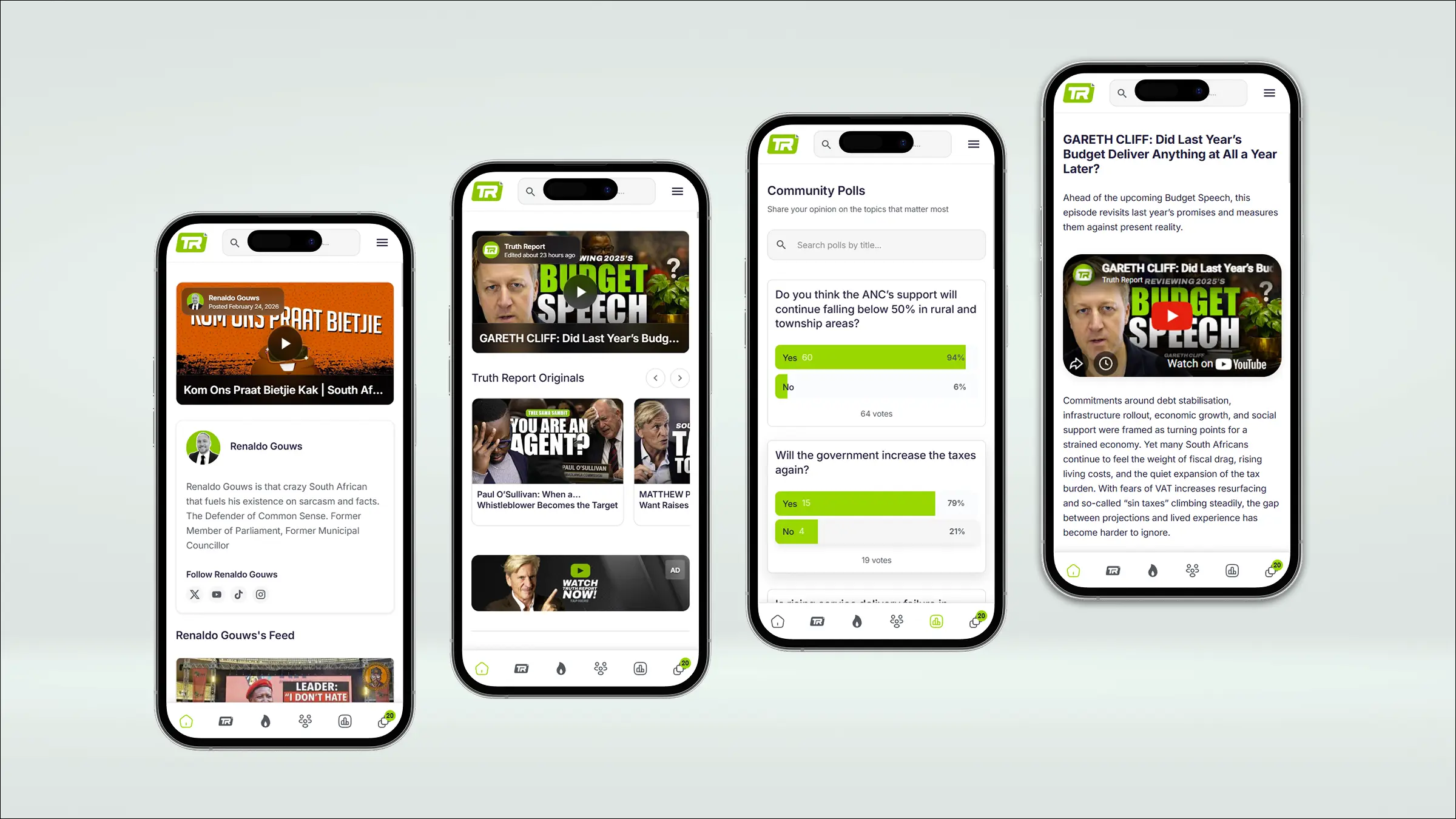
Truth Report is a South African news platform built around one hard idea: that people will trust journalism which looks and reads like it takes itself seriously. As lead designer, working with two other developers through to the React build, every decision served that goal. Typography chosen for long reading. A content hierarchy that never shouts. Author profiles that put real people behind the reporting. A generic news template could never have carried that weight. You can read the full story in our Truth Report case study.
BestBet had the opposite challenge. Sports tipping is a category full of services that quietly delete their losing picks. BestBet wanted to win by being radically honest, with every tip timestamped on a permanent ledger and a public leaderboard ranking tipsters by real returns. We designed the product from a blank canvas and built the React front end, so the ledger, leaderboard and betting tools feel like one product instead of four. The design is the brand promise made visible. More in the BestBet case study. We have also worked with BetMatch, a new South African betting exchange.
Orobit brings smart contracts and real-world asset tokenisation to Bitcoin, with Lightning for fast, low-cost payments. That is a lot of complexity to hand to a user. The design work was about translation: making institutional-grade technology feel clear enough for a traditional investor without talking down to crypto natives. We designed and developed the platform from concept to production, as described in the Orobit case study. In the same Bitcoin space we have worked with SQRL, whose enterprise platform handles Bitcoin-native custody and tokenisation for institutions.
KeyKasa set out to take on South Africa's established property portals. Instead of a filter form, you describe the home you want in plain English. Instead of endless scrolling, you swipe a shortlist. A live 3D map shows what an area is actually like. We worked on it from brand to launch as frontend engineer and product designer alongside the KeyKasa team. The whole product exists to feel nothing like the portals it competes with, which is precisely the point. See the KeyKasa case study.
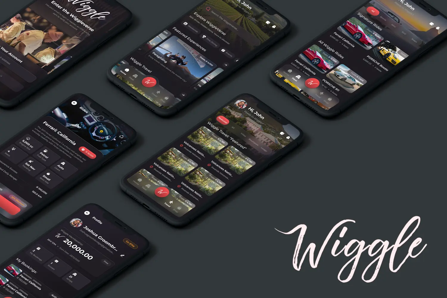
And then there is Wiggle, the Cape Town car hire club with a restaurant, The Wiggle Room, at its heart. Wiggle is not a booking engine and never wanted to feel like one. Through workshops and prototyping, and working closely with the development team on the React Native app, we built an experience where members can book a Porsche, a table and a Cape Town adventure in one place, with the playful personality of the brand on every screen. That personality is the product. A template would have erased it. Read the Wiggle case study.
Look at those projects side by side and you will notice something. They do not look alike. A news platform, a betting ledger, a Bitcoin protocol, a property portal and a car club each ended up with a visual language that belongs to them. That is what happens when you start from the business instead of from the defaults.
Why the relationship matters more than the website
There is a reason all of those projects went deep. A generic website can be ordered like a pizza. A distinctive one has to be understood first, and understanding takes a relationship. The founders we work with talk directly to the people designing and building their product. We sit in their workshops, learn their customers, argue about their headlines, and stay around after launch to watch what real users do.
That closeness is where the good ideas come from. It is how a tipping platform ends up built on radical transparency, and how a car hire company ends up with an app that feels like a members' club. No prompt would have produced either, because the insight lived in a conversation, not in a training set.
In practice, our projects follow a rhythm that looks old fashioned next to a prompt box, and we think that is its strength. We begin with conversations and workshops, sometimes several, before anything is drawn. We map what your customers are trying to do and where they get stuck today. We shape the brand and the words together, because a beautiful layout cannot rescue a vague message. Then we prototype in Figma so you can click through the experience before a line of production code exists, and only then do we build.
AI is part of that process, not a replacement for it. We use it to explore directions quickly, generate variations, draft boilerplate code and test ideas, which frees up time for the parts that need judgement. Every decision that reaches your customers is still made, reviewed and owned by a person who knows your business by name.
And the relationship does not end at launch. The real learning starts when real people use the product. Which pages do they skip? Where do they hesitate? What do they search for that you never expected? The best websites are not finished on launch day. They get sharper every month because someone is paying attention.
The best ideas on our clients' websites were never in the brief. They came out of the fifth conversation, once we understood the business well enough to see them.
How to make your website stand out in 2026
Whether or not you work with us, these are the questions worth asking about your own website:
- Could a competitor swap their logo onto your homepage? If the answer is yes, your design is not saying anything about you yet.
- Does your headline say what you do and who it is for? Clever lines are fun. Clear lines convert.
- How fast is it on a phone on mobile data? Test it. Compress your images (our free image compressor helps) and cut anything that does not earn its place.
- Is there one obvious next step on every page? A booking, an enquiry, a purchase. Visitors should never have to hunt for it.
- Would an AI assistant understand your business from your site? Clear headings, honest answers to common questions and genuinely original content make you easier to recommend.
- Who checked the security? If your app was generated, someone who understands the code should review it before real customers trust it with their data.
AI has made the first version of a website almost free. That is wonderful, and it will not reverse. What it has also done is make genuine craft rare again, and rare things are valuable. The businesses that win the next few years will not be the ones who built the fastest. They will be the ones whose websites feel unmistakably like them, work flawlessly, and turn the visitors who arrive into customers who stay.
If that is the kind of website you want, tell us about your business. Or, if you already built something with an AI tool and it is starting to creak, have a look at how we take AI-built apps to production.
Frequently asked questions
Why do AI-generated websites all look the same?
AI builders learn from existing web code, and much of it uses the same frameworks, component libraries and default styles. Ask for a landing page and the model returns the average of what it has seen, which is why purple gradients, rounded cards and indigo buttons appear everywhere.
How is web design in 2026 different from traditional web design?
Traditional web design ran on briefs, wireframes, revisions and hand-written code, which was slow but forced someone to understand your business. In 2026, AI builders can produce a working site from a prompt in minutes. Speed is no longer the differentiator. Distinctive branding, strategic thinking and solid engineering are.
Is it bad to build my website with an AI builder?
No. AI builders are excellent for prototypes, quick experiments and simple sites. The risk comes when a generated site becomes your main sales channel without anyone designing it for your brand, checking its speed and accessibility, or reviewing its security.
What is bespoke web design?
Bespoke web design means every meaningful decision, from typography and colour to layout, copy and performance, is made on purpose for your business and customers instead of being taken from a template or a tool's defaults.
Does website design really affect sales?
Yes. Research shows people judge a page's visual appeal in around 50 milliseconds, and design is the factor mentioned most often when people assess a site's credibility. Speed matters too: Google and Deloitte found a 0.1 second faster mobile site lifted retail conversions by 8.4%.
How do AI Overviews in Google change web design priorities?
AI summaries reduce how often people click through to websites, so each visit is worth more. Sites need to convert well, load fast on mobile, and present clear, original, well structured content that search engines and AI assistants can understand and cite.
How much does a bespoke website cost?
It depends on the scope. As a guide, our landing pages start from about R5,200 and multi-page custom websites from about R45,300, with larger web applications quoted per project. Our quote builder gives an instant estimate.
Can you improve a website I already built with AI?
Yes. We regularly audit AI-built sites and apps, keep what works, fix security and performance issues, and redesign the parts that feel generic. See our Lovable alternative page for how that process works.
 Let's talk about your project!